Typographers Have Field Day With New Designs
- Even expert with retentive memory for the elusive serif finds going tough
- Bulk of advertising today appears in conventional attire of standard types
- Here are some suggestions for classifying new faces in familiar groups
Type design enthusiasts have been enjoying a field day recently, particularly in the realm of display typography. The proper identification of the type always has been a point of pride with the careful compounds other desires to keep up with typographic trends. Today, however, he might be excused for a slight let-down in standards under the onslaught of new designs from the world’s type foundries.
Even expert with the retentive memory for that elusive serif is finding the going tough. Added competition from photolettering devices and the distortion camera has made his task more difficult.
The bulk of today’s advertising appears in the conventional attire of the standard types, such as the classical letters of Garamond, Baskerville, and Bodoni, the square serifs, the many gothic, and most popular modern sans serifs. A gradual influx of postwar type designs is now becoming evident. For example, in a recent issue of this magazine, some 30 display ads used types which were not available prior to 1947.
Some may argue that the current “hot” favorite, the wide gothic, is not new at all but a resurrection from a nineteenth century storage bin, but the fact remains that wide gothic is being used extensively.

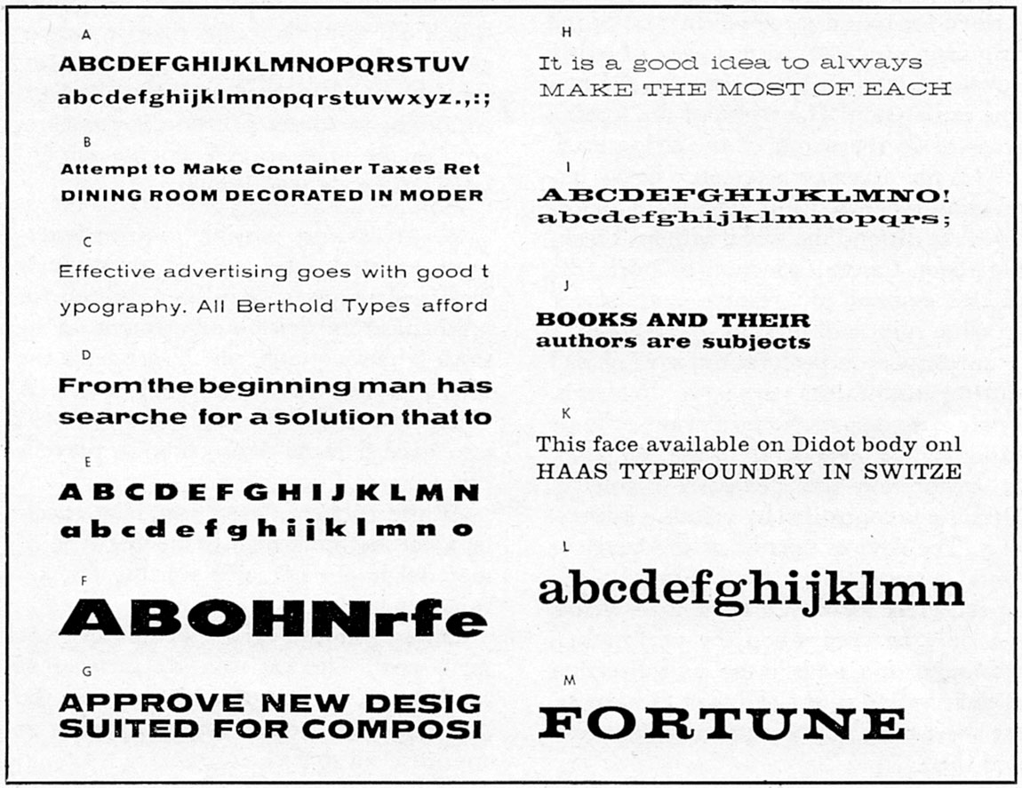
Currently popular "wide" faces can be grouped as above for easier identification. Extended gothics are (A) Franklin Gothic Wide; (B) Venus Extrabold Extended; (C) Standard Extended; (D) Anonce Grotesque; (E) Twentieth Century Ultrabold Extended; (F) Airport Broad; and (G) Tempo Black Extended. Extended square serifs include (H) HEllenic Wide; (I) Egyptian Expanded; and (J) Egyptian Bold Extended. The "Clarendon family" includes (K) Clarendon; (L) Craw Clarendon; and (M) Fortune faces.
Letters Match Architecture
It is often difficult to analyze the reasons for design’s popularity. In this case, it is undoubtedly the fact that the low, wide shape of the letter matches the contours of modern ideas in architecture, interior decoration, and engineering design.
In a further exploration of the possibilities of the wide gothic, type founders are now considering the application of the principle to the square serifs and two other standard printing type styles.
The reëmergence of a popular French type of one hundred years ago, Clarendon, is more difficult to understand, though it does present a more legible appearance, with its filleted serifs, then the purely square-serif letter run through the wringer. Not to be discarded, though, is the probability that many revivals are but the result of the constant search for something new and different.
With the reëmergence of Clarendon, we have returned to something which we had never actually abandoned. That is the durable old Cheltenham, which in boldface is very close to Clarendon. With Chelt available in numerous variations, there’s some excuse for dusting off the best-known type ever to have been designed by an American.
Those compositors who follow the history of their craft know that the extravagant, pompous types of the last century all older conception to her then relatively new idea, that of printing for commerce. Prior to the nineteenth century, the bulk of printing was produced in the form of books and newspapers. The advertiser, then, can be credited with creating interest in the selling power of a type face, interest which later gave rise to such a fantastic race by competing type foundries.
There can never be returned to that period, because today, fortunately, there is a mature approach by advertiser and printer alike. Both are aware of the complexities of production of the printed word. Then, too, it is doubtful that it would be economically feasible for type founders to compete in such an year responsible manner as they did in past years.
Faces Easily Grouped
Most of the new crop of type faces can be grouped easily for identification. They are principally sans serifs, square serifs, scripts, and decorative letters.
In the sans serif category are the extended gothic, which are available through several foundries. For example:
American Type Founders—Franklin Gothic Wide
Bauer (Germany)—Venus
Amsterdam (Holland)—Anonce Grotesque
Berthold (Germany)—Standard Extended
Lanston Monotype—20th Century Ultrabold Extended
Baltimore—Airport Broad
Ludlow—Tempo Black Extended
The last three types are modifications of the modern sans serifs. The others are closer in style to the regular gothic. It is interesting to note that in Europe all sans serifs are known as “grotesques.”
The extended square serifs are fewer in number and not quite as popular. This situation could almost have been predicted, because a similar state of affairs existed in the late ’30s. When the square serifs challenge the sans serif types in popularity for short period. Some of the extended square serifs are:
Bauer (Germany)—Hellenic Wide
Stephenson Blake (England)—Egyptian Expanded
Amsterdam (Holland)—Egyptian Bold Extended
The Clarendons may be listed properly as square serif types. The set of this letter, although wider than that of normal types, is not great enough to be classed as extended. Current Clarendon designs are:
Haas (Switzerland)—Clarendon
American Type Founders—Craw Clarendon
Bauer (Germany)—Fortune
By the time this magazine is off the press, there very well may be several additions to these listings.
With an eye on the dollar market, the European foundries have been actively producing an amazing variety of script types, which will be discussed in this department next month.
This article first appeared in “The Composing Room” column of the October 1955 issue of The Inland Printer.