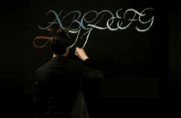
November 8
“Born in Nurnberg on 8 November, 1918, I spent my childhood in that factory town. My parents lived in a small settlement in the city’s southern section, and I roved the bordering woods with my schoolmates and was seldom to be found at home. I chased butterflies, caught salamanders and gathered flowers and stones.”
So wrote Hermann Zapf in his charming and informative book About Alphabets. In the post-World War II era he has developed into one of the foremost designers of type. Yet, as a schoolboy, his writing was so wretched that he felt himself fortunate to receive a B in penmanship.
“My first systematic attempts at writing with the broad-edged pen,” he writes, “began in 1935. . . . The fashioning of letters may to many seem a trifling activity, but whoever has occupied himself with it intensively will properly understand a guest-book entry of 1932 by Rudolf Koch: The making of letters in every form is for me the purest and the greatest pleasure, and at many stages of my life it was to me what a song is to the singer, a picture to the painter, a shout to the elated, or a sight to the oppressed—it was and is for me the most happy and perfect expression of my life.’
“With tireless zeal in my spare time,” Zapf continues, “I wrote pages of letters that often left me unsatisfied because the models in the books looked so much better—until one day I discovered I had been holding my edged pen in a false position, whereupon things began to look up. But of course no one who is self-taught can be spared such roundabout journeys. Evenings and weekends I sat at home writing and writing—or rather practising, for the waste-basket was always full of written pages. My parents considered me almost out of my senses, father being annoyed by the added cost of electric current occasioned by my work at night. My friends went out for dancing and amusement; I stayed at home and bravely drew letters.”
Such diligence was productive, however, as by the time he was twenty Zapf was commissioned by the famous Stempel typefoundry to design a type, a fraktur, named Gilgengart, and his career was fully launched. Zapf s approach to the problems of type design is traditional and is somewhat akin to that of the American type designer, Frederic W. Goudy, whom Zapf greatly admires.
A single paragraph in About Alphabets comes close to summarizing Zapf’s thinking about letterforms:
“A new printing type has a long, often thorny way to completion. Before a type has come far enough to please outsiders, it adds gray hairs to its co-producers. Important in the matter is the type’s design; a long time is needed to perfect all its details. The imaginary notion of letters from A to Z does not itself suffice, and by the time these more or less vague proposals and fancies attain a definite form, all may look quite different on printed paper. A design needs just not any forms, but good forms that harmonize with the remaining shapes, all distinguishable as signs and of noble character.”
