Anatomy of a Type: Century—Part 3
Linn Boyd Benton has received credit in all accounts for the designing of the Century type. Presumably he enlisted the assistance of a number of punch cutters at ATF, although why any of them would have wanted to help him is beyond understanding, since some seven years earlier Benton had actually invented a device which made the hand cutting of punches an occupation with a most dubious future, and in point of fact had vastly contributed to the obsolescence of that craft.
The Benton matrix engraving machine eliminated the need not only to cut punches by hand but to cut them at all for the production of foundry type. It also absolutely assured the success of the typefounders’ major competitor, Ottmar Mergenthaler’s Linotype machine, and thus knocked the underpinnings from the typefoundries themselves. Paradoxically the matrix engraver was adapted to cutting punches for this latter operation, since punches are needed for the high-speed manufacture of the matrices required for machine typesetting.
However, all of this was in the future and the collaboration of De Vinne and L.B. Benton was responsible for the birth of what was probably the first typeface designed to meet both specific technical printing requirements and the then tentative precepts of what later became a primary demand, a “legibility” typeface.
The March 1896 issue of The Century Magazine featured a discussion of its exclusive type. The editors, apparently not trusting the discerning eyes of its cerebral readers, ask De Vinne to explain the rationale for the new face. The printer cited the “feeble impression” of such contemporary printing which, he believed, contributed to “continual strain of eyesight.” He also mentioned that the trend was toward “bolder and stronger print.” He noted that established canons of type design had required boldness—and thus greater readability—to be tied to character width but that in periodical printing with its two or more columns per page and narrow margins, such a concept represented an incongruity.
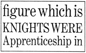
It therefore became necessary to convince the letter to achieve the desired effect of increased size by virtue of what later was termed larger x-height. From the publisher’s viewpoint, of course, economy of space was most desirable. Unquestionably the designers succeeded in their search for a face of more open counters and heavier weight without sacrifice of character count.
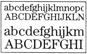
There is no evidence that the new dress sold more copies of The Century or even that other publishers made demands for similar type. Actually the prevailing opinion of the time was that the face was a bit too condensed for general use. De Vinne prevailed upon L.B. Benton once again to provide a slightly less condensed version of Century for the De Vinne Press, to be used in bookwork. This type was called by De Vinne Century Broad-Face. It became, in 1900, the model for Century Expanded. This third member of the Century family resulted from the collaboration between L.B. Benton And his son, Morris Fuller Benton, a recent (1896) engineering graduate of Cornell University. The tradition of having Century cut by non-type-designers was thus continued. The younger Benton, who had been hired by ATF to consolidate its widely scattered manufacturing facilities into one plant, eventually became the most prolific of all type designers, American or European, although never so well-known as many of his contemporaries in the field.
Century Expanded became the most popular of all the Century types and has survived as a type for the text composition of advertisements. It is currently available on the majority of the new typesetting devices. Since its inception, the term expanded has created confusion, as it is a condensed type. It must be remembered that it was originally has a wider version of the first Century type, which was even more condensed.
In the current Century series offered by International Typeface Corporation under license from American Type Founders Company, Century Expanded is now called Century Light. Redrawn from the original face by designer Tony Stan, this revision features slightly reduced ascenders, along with half serifs at the foot of such lowercase letters as m and n, following the later Benton design of Century Bold.
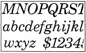
Morris Benton’s next addition to the Century series came in 1906 with a version called Century Bold. This modification became a major display type represent simply a thickening of the basic weight of the standard. In a supplement to the 1906 ATF Specimen Book, issued in 1909, Century Oldstyle was added to the line. Here the upper serifs of ascending lowercase letters (d, l, k, etc.) were slanted, along with the “Caslonizing” of the caps. Thus the oldstyle actually became an illegitimate member of a family of types which attempted something new never did achieve the success of its brethren, although and Oldstyle Bold Italic and Oldstyle Bold Condensed were added by 1916.
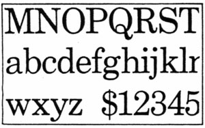
The last Benton-designed Century was the Schoolbook series, including italic and boldface. Century Schoolbook’s initial appearance was in the 1920 Supplement No. 2 to the great 1912 ATF type catalog. Essentially, Benton carries forward in the face the original “legibility” concept of the first type in the family. Here is a normal width type in which the open counters, large x-night, and squared-off serif structure are brought to fulfillment. Similar design characteristics became the basis, a few years later, for such newspaper types as Ionic, Excelsior, and others.
Like its parent, Schoolbook resulted from the request of a publisher of textbooks, Ginn & Company, for type which would embody some of the principles concerning typographic legibility then coming to light. While in no way as voluminous as it was to become in the post World War II era, the literature of readability studies was nevertheless growing.
It had been stated that Morris Benton, in his design of Century Schoolbook, was influenced by B.E. Roethlein’s study at Clark University in 1911, published under the title of “The Relative Legibility of Different Faces of Printing Types” in the January 1912 issue of American Journal of Psychology. Miss Roethlein made comparisons of 26 contemporary types and reached the conclusion that Century Expanded and Century Oldstyle, along with News Gothic, Bulfinch, Clearface and Cheltenham Wide were the best. The lady’s conclusions are somewhat suspect, since she listed Cheltenham Oldstyle and Caslon No. 540 (ATF) as the worst from the standpoint of legibility. As to the incredible selection of Bulfinch, I can only suggest that readers look it up and marvel.
This early venture into legibility-readability studies, despite its findings, did suggest the criteria for judgment, and no doubt that in was interested in this aspect. Certainly in the Schoolbook series he produced the type that subsequently turned up on nearly every list of legible types. At present, the name may vary somewhat, depending on the source, styled as Century Medium, Century Modern, or Century Text. In the ITC listing it turns up as Century Book.
The last type in the Century series to be developed by ATF came along fairly late, in 1964, long after Morris Benton’s death in 1948. The foundry commissioned Charles Hughes to draw what could very well have been named Century Expanded Condensed, a redundancy to cower the more rabid classifiers of printing types into abject silence. Fortunately it was called Century-Nova, and just as fortunately it was an excellent addition to the family, allowing the group of types to and its metal. In a felicitous manner. No doubt the digitizers will come up with a few more variations, but they will encounter great difficulty in attempting to improve the breed.
Theodore Low De Vinne would no doubt be mightily pleased that his idea for type which would retain its readability under numerous technological fluctuations has proved its value for so long a period. While always sympathetic to esthetic considerations in the design of printing types, he recognize the place of practicality in a changing environment.
This article first appeared in the January 1982 issue of Printing Impressions.


